


March 2024 - July 2024
March 2024 - July 2024
March 2024 - July 2024
SiteWrapped
SiteWrapped

what is SiteWrapped?
what is SiteWrapped?
THE PROJECT
Have you ever landed on a website and been overwhelmed by the number of features, pictures, amount of text, etc.? SiteWrapped is here to help!
SiteWrapped uses web analytics and an AI engine to present fashionable trends based on popular behavior, which leads the user to explore other parts of the website.
the team
Designer (me), front-end developer, product manager
skills used
UI/UX Design
Figma
Collaboration
Prototyping
the project
I designed this experience for Our Fashion Garden, a company that promotes environmentally friendly styling, that aligns with the website's branding and provides essential information about the website.
Have you ever landed on a website and been overwhelmed by the number of features, pictures, amount of text, etc.? SiteWrapped is here to help!
SiteWrapped uses web analytics and an AI engine to present fashionable trends based on popular behavior, which leads the user to explore other parts of the website.
the team
Designer (me), front-end developer, product manager
skills used
UI/UX Design
Figma
Collaboration
Prototyping
the project
I designed this experience for Our Fashion Garden, a company that promotes environmentally friendly styling, that aligns with the website's branding and provides essential information about the website.
Have you ever landed on a website and been overwhelmed by the number of features, pictures, amount of text, etc.? SiteWrapped is here to help!
SiteWrapped uses web analytics and an AI engine to present fashionable trends based on popular behavior, which leads the user to explore other parts of the website.
the team
Designer (me), front-end developer, product manager
skills used
UI/UX Design
Figma
Collaboration
Prototyping
the project
I designed this experience for Our Fashion Garden, a company that promotes environmentally friendly styling, that aligns with the website's branding and provides essential information about the website.
industry inspo - "wrapped" features
industry inspo - "wrapped" features
THE PROJECT
To gather inspiration for our product, we surfed the Internet for inspiration on presenting trends:
To gather inspiration for our product, we surfed the Internet for inspiration on presenting trends:
To gather inspiration for our product, we surfed the Internet for inspiration on presenting trends:
Spotify Wrapped: takes the user’s listening data from the entire and presents this data in an engaging story-like summary.
Shareable
New design every year
Contextualized with other user data
Pinterest Predicts: presents trendy search terms and allows users to shop related content
Spotify Wrapped: takes the user’s listening data from the entire and presents this data in an engaging story-like summary.
Shareable
New design every year
Contextualized with other user data
Pinterest Predicts: presents trendy search terms and allows users to shop related content
Spotify Wrapped: takes the user’s listening data from the entire and presents this data in an engaging story-like summary.
Shareable
New design every year
Contextualized with other user data
Pinterest Predicts: presents trendy search terms and allows users to shop related content
To gather inspiration for our product, we surfed the Internet for inspiration on presenting trends:
Spotify Wrapped: takes the user’s listening data from the entire and presents this data in an engaging story-like summary.
Shareable
New design every year
Contextualized with other user data
Pinterest Predicts: presents trendy search terms and allows users to shop related content
user research - "wrapped" features
user research - "wrapped" features
THE PROJECT
We conducted brief interviews on our target users' thoughts and feelings on “wrapped” insight stories, as well as common behavior with new websites.
what did we find?
Overwhelming visiting a new website
Users need to look around for call-to-action buttons & product descriptions
Thoughts on Spotify Wrapped/Pinterest Predicts:
Good way to sum up personal experiences/data
Gain a holistic view of trends based on other people’s content interaction
Thoughts on a wrapped feature for a website:
Positive insights - can help to “summarize” popular web content
We conducted brief interviews on our target users' thoughts and feelings on “wrapped” insight stories, as well as common behavior with new websites.
INSIGHTS
Overwhelming visiting a new website
Users need to look around for call-to-action buttons & product descriptions
Thoughts on Spotify Wrapped/Pinterest Predicts:
Good way to sum up personal experiences/data
Gain a holistic view of trends based on other people’s content interaction
Thoughts on a wrapped feature for a website:
Positive insights - can help to “summarize” popular web content
To gather inspiration for our product, we surfed the Internet for inspiration on presenting trends:
Spotify Wrapped: takes the user’s listening data from the entire and presents this data in an engaging story-like summary.
Shareable
New design every year
Contextualized with other user data
Pinterest Predicts: presents trendy search terms and allows users to shop related content
our client!
WHO IS OUR CLIENT?
As a whole, our client is any company that wants to promote their existing content and products through their website.
Our first client, therefore, is "Our Fashion Garden" (OFG), who we reached out to offer our product idea to.
As a whole, our client is any company that wants to promote their existing content and products through their website.
Our first client, therefore, is "Our Fashion Garden" (OFG), who we reached out to offer our product idea to.

PITCHING TO OUR FASHION GARDEN
PITCHING TO OUR FASHION GARDEN
When my team solidified the idea, we pitched the idea to OFG, highlighting the four main results from integrating SiteWrapped with their website:
When my team solidified the idea, we pitched the idea to OFG, highlighting the four main results from integrating SiteWrapped with their website:
01 Traffic Acquisition:
Increase interest and funnel new people to the website
02 Site Stickiness:
Expand exploration of website content through a unique medium
03 User Retention:
Increase content value and keep customers returning
01 Traffic Acquisition:
01 Traffic Acquisition:
Increase interest and funnel new people to the website
Increase interest and funnel new people to the website
02 Site Stickiness:
02 Site Stickiness:
Expand exploration of website content through a unique medium
Expand exploration of website content through a unique medium
03 User Retention:
03 User Retention:
Increase content value and keep customers returning
Increase content value and keep customers returning
04 Visual Attraction:
04 Visual Attraction:
Appeal to users with the carousel's visual design
Appeal to users with the carousel's visual design
Reconciling our design suggestion with client preference:
Our suggestion was to present the insight story as a featured carousel at the top of the home page, and use its visual design to attract users.
However, the client preferred a pop-up featured carousel, which would cause the least disruption to main website experience, so that's what we decided to go with.
Reconciling our design suggestion with client preference:
Our suggestion was to present the insight story as a featured carousel at the top of the home page, and use its visual design to attract users.
However, the client preferred a pop-up featured carousel, which would cause the least disruption to main website experience, so that's what we decided to go with.
USER RESEARCH - POP-UP BEHAVIOR
USER RESEARCH - POP-UP BEHAVIOR
Once we settled on a pop-up as our format for the carousel, we did some user research to analyze user thoughts about pop-up features.
We surveyed ~15 people to gauge feelings on pop-ups (appearing on first landing vs. trigger button)
INSIGHTS
Users generally dislike email prompt pop-ups.
Pop-ups that appear immediately after first landing tend to frustrate users more.
Users had a positive reaction to pop-ups that only provide website info.
Since the client preferred a pop-up, we decided to create an intro slide—this would welcome the user in an engaging manner that invites them to explore trends & insights.
The pop-up featured carousel would appear on first landing and re-appear through an active trigger button.
Once we settled on a pop-up as our format for the carousel, we did some user research to analyze user thoughts about pop-up features.
We surveyed ~15 people to gauge feelings on pop-ups (appearing on first landing vs. trigger button)
INSIGHTS
Users generally dislike email prompt pop-ups.
Pop-ups that appear immediately after first landing tend to frustrate users more.
Users had a positive reaction to pop-ups that only provide website info.
Since the client preferred a pop-up, we decided to create an intro slide—this would welcome the user in an engaging manner that invites them to explore trends & insights.
The pop-up featured carousel would appear on first landing and re-appear through an active trigger button.
STEP 1: THE ANALYSIS
STEP 1: THE ANALYSIS
Data Sources: In order to create our insights we went through OFG’s web analytics to understand their users and what trends and webpages they explore.
Web analytics (i.e. Google Analytics 4)
Scraped text content from website
Public 3rd party sources to aid in storytelling/contextualizing data
Google Search Console
Wikipedia
The data we focused on were # of views and summaries of those webpages.
Data Sources: In order to create our insights we went through OFG’s web analytics to understand their users and what trends and webpages they explore.
Web analytics (i.e. Google Analytics 4)
Scraped text content from website
Public 3rd party sources to aid in storytelling/contextualizing data
Google Search Console
Wikipedia
The data we focused on were # of views and summaries of those webpages.
Data Sources: In order to create our insights we went through OFG’s web analytics to understand their users and what trends and webpages they explore.
Web analytics (i.e. Google Analytics 4)
Scraped text content from website
Public 3rd party sources to aid in storytelling/contextualizing data
Google Search Console
Wikipedia
The data we focused on were # of views and summaries of those webpages.
Using Web Analytics - Using AI and Creating the Insights
Using these analytics, we created a few insights for each webpage and used AI to help us choose the best and most relevant insights that we could display in a story.
Each insight would be presented in this form:
Using Web Analytics - Using AI and Creating the Insights
Using these analytics, we created a few insights for each webpage and used AI to help us choose the best and most relevant insights that we could display in a story.
Each insight would be presented in this form:
Using Web Analytics - Using AI and Creating the Insights
Using these analytics, we created a few insights for each webpage and used AI to help us choose the best and most relevant insights that we could display in a story.
Each insight would be presented in this form:
01 A header detailing the insight
01 A header detailing the insight
01 A header detailing the insight
02 Supporting subtext leading into
02 Supporting subtext leading into
02 Supporting subtext leading into
03 A call-to-action that encourages the user to explore the insight.
03 A call-to-action that encourages the user to explore the insight.
03 A call-to-action that encourages the user to explore the insight.
Example:
Header: Revamp your summer closet!
Subtext: 56% of users keep coming back for wardrobe refresh tips!
Button: Keep Refreshing Your Wardrobe!
Example:
Header: Revamp your summer closet!
Subtext: 56% of users keep coming back for wardrobe refresh tips!
Button: Keep Refreshing Your Wardrobe!
Example:
Header: Revamp your summer closet!
Subtext: 56% of users keep coming back for wardrobe refresh tips!
Button: Keep Refreshing Your Wardrobe!
STEP 2: THE DESIGN
STEP 2: THE DESIGN
USER FLOW
Once we had reviewed and finalized the insights with our client, I began to work on the design. For our insight story, we settled on an Instagram-post like format:
USER FLOW
Once we had reviewed and finalized the insights with our client, I began to work on the design. For our insight story, we settled on an Instagram-post like format:
USER FLOW
Once we had reviewed and finalized the insights with our client, I began to work on the design. For our insight story, we settled on an Instagram-post like format:
Our user flow would begin with an intro slide (“Welcome to Our Fashion Garden!”), followed by the three insights that the user could swipe through and explore.
Our user flow would begin with an intro slide (“Welcome to Our Fashion Garden!”), followed by the three insights that the user could swipe through and explore.
Our user flow would begin with an intro slide (“Welcome to Our Fashion Garden!”), followed by the three insights that the user could swipe through and explore.
INITIAL WIREFRAMING - INTRO SLIDE
INITIAL WIREFRAMING - INTRO SLIDE
Additionally, we looked at Our Fashion Garden's Instagram for design inspiration, and found that they make use of colorful squiggles in their posts, so I decided to incorporate those in our mockups.
Initial Design Components:
Rectangle design
Client logo next to introduction
Pictures of clients
Squiggly lines from client’s Instagram page
Additionally, we looked at Our Fashion Garden's Instagram for design inspiration, and found that they make use of colorful squiggles in their posts, so I decided to incorporate those in our mockups.
Initial Design Components:
Rectangle design
Client logo next to introduction
Pictures of clients
Squiggly lines from client’s Instagram page
Additionally, we looked at Our Fashion Garden's Instagram for design inspiration, and found that they make use of colorful squiggles in their posts, so I decided to incorporate those in our mockups.
Initial Design Components:
Rectangle design
Client logo next to introduction
Pictures of clients
Squiggly lines from client’s Instagram page


To adhere to a more standard pop-up modal design, we decided to go with a square shape instead of a rectangle.
Logo and client photos seemed redundant, since those were already displayed on the homepage, so I removed those as well.
To adhere to a more standard pop-up modal design, we decided to go with a square shape instead of a rectangle.
Logo and client photos seemed redundant, since those were already displayed on the homepage, so I removed those as well.
To adhere to a more standard pop-up modal design, we decided to go with a square shape instead of a rectangle.
Logo and client photos seemed redundant, since those were already displayed on the homepage, so I removed those as well.

LO-FIS
LO-FIS
LO-FIS
Keeping the visual design consistent and varying the placement of the text and the call-to-action button was what made designing this experience all the more challenging. I had to make sure that each insight was different from the next, but not so different that it would be jarring to the user.
Keeping the visual design consistent and varying the placement of the text and the call-to-action button was what made designing this experience all the more challenging. I had to make sure that each insight was different from the next, but not so different that it would be jarring to the user.
Keeping the visual design consistent and varying the placement of the text and the call-to-action button was what made designing this experience all the more challenging. I had to make sure that each insight was different from the next, but not so different that it would be jarring to the user.

HI-FI MOCKUPS: POP-UP
HI-FI MOCKUPS: POP-UP
Iteration #1
Iteration #1


Iteration #1 involved experimenting beyond Our Fashion Garden's Instagram and website designs. In order to bring life to the pop-up I added a white border around the header text bubble and the squiggles that took over the corners.
The button and text design were taken directly from Our Fashion Garden's brand and design system.
Iteration #1 involved experimenting beyond Our Fashion Garden's Instagram and website designs. In order to bring life to the pop-up I added a white border around the header text bubble and the squiggles that took over the corners.
The button and text design were taken directly from Our Fashion Garden's brand and design system.
Iteration #1 involved experimenting beyond Our Fashion Garden's Instagram and website designs. In order to bring life to the pop-up I added a white border around the header text bubble and the squiggles that took over the corners.
The button and text design were taken directly from Our Fashion Garden's brand and design system.
Iteration #2
Iteration #2


After receiving feedback from Our Fashion Garden for iteration #1, I added a white border around the pop-up itself, and kept the white border around the header bubble and intro yellow pill only.
In this iteration, I also experimented with the close action UI, moving it halfway out of the pop-up.
After receiving feedback from Our Fashion Garden for iteration #1, I added a white border around the pop-up itself, and kept the white border around the header bubble and intro yellow pill only.
In this iteration, I also experimented with the close action UI, moving it halfway out of the pop-up.
After receiving feedback from Our Fashion Garden for iteration #1, I added a white border around the pop-up itself, and kept the white border around the header bubble and intro yellow pill only.
In this iteration, I also experimented with the close action UI, moving it halfway out of the pop-up.
Iteration #4 - THE FINAL ITERATION
Iteration #4 - THE FINAL ITERATION


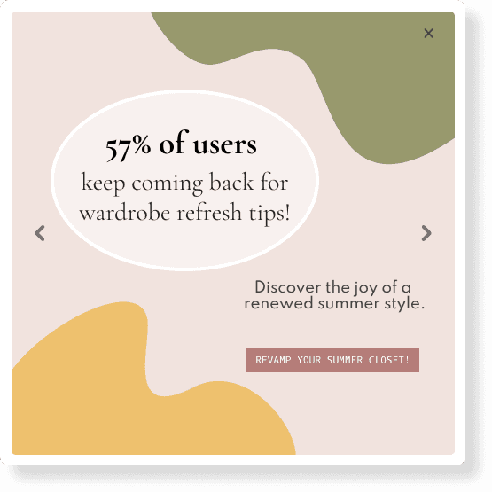

The final iteration included the final insights (which were deemed most important to Our Fashion Garden).
Our decision to change the Instagram post carousel indicator to chevron arrows stemmed from providing more intuition to our user of a carousel widget, and better and more obvious indication of multiple slides.
To provide more depth, I added a drop shadow and a white border around the pop-up.
The final iteration included the final insights (which were deemed most important to Our Fashion Garden).
Our decision to change the Instagram post carousel indicator to chevron arrows stemmed from providing more intuition to our user of a carousel widget, and better and more obvious indication of multiple slides.
To provide more depth, I added a drop shadow and a white border around the pop-up.
The final iteration included the final insights (which were deemed most important to Our Fashion Garden).
Our decision to change the Instagram post carousel indicator to chevron arrows stemmed from providing more intuition to our user of a carousel widget, and better and more obvious indication of multiple slides.
To provide more depth, I added a drop shadow and a white border around the pop-up.
HI-FI MOCKUPS: SITE PLACEMENT
HI-FI MOCKUPS: SITE
PLACEMENT
Once we finalized the pop-up design, we brainstormed placements on the site and a button to allow the user to pull up SiteWrapped.
Once we finalized the pop-up design, we brainstormed placements on the site and a button to allow the user to pull up SiteWrapped.
Originally, we thought about having the pop-up being pulled up from a floating action button, like so:
Originally, we thought about having the pop-up being pulled up from a floating action button, like so:
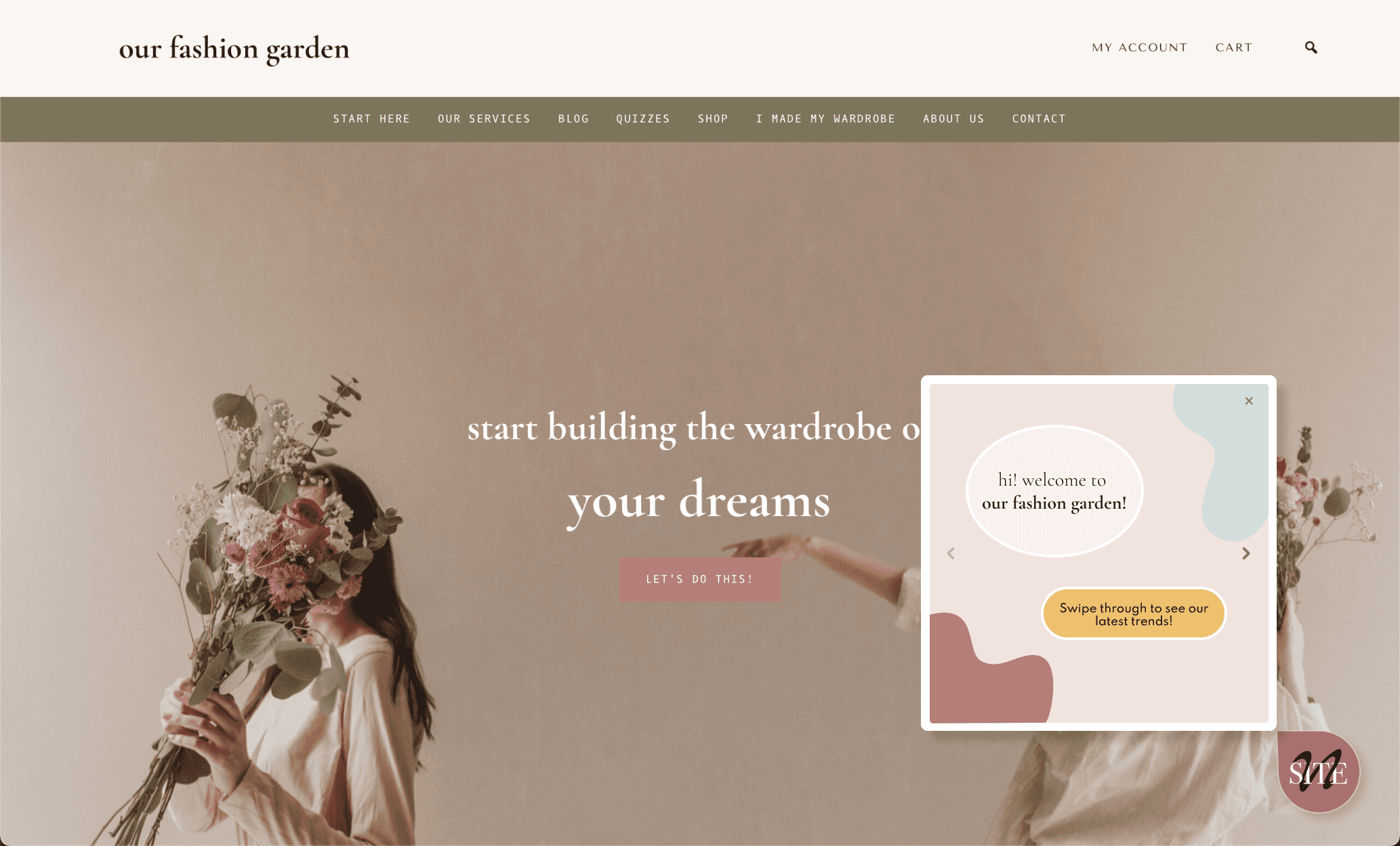
However, we realized that this would be too much of a disruption to the website's experience, since a FAB stays fixed while scrolling.
Therefore, we decided to go with a active trigger button, and started ideating.
However, we realized that this would be too much of a disruption to the website's experience, since a FAB stays fixed while scrolling.
Therefore, we decided to go with a active trigger button, and started ideating.
TRIGGER BUTTONS
TRIGGER BUTTONS
To symbolize SiteWrapped as a trigger button, we decided to use the sparkle emoji, which is commonly associated with AI.
To symbolize SiteWrapped as a trigger button, we decided to use the sparkle emoji, which is commonly associated with AI.


A pill button provides a better indication that the user can view website trends at a single click, so we decided to prototype using this button (right) and sent to our client for feedback.
A pill button provides a better indication that the user can view website trends at a single click, so we decided to prototype using this button (right) and sent to our client for feedback.
A pill button provides a better indication that the user can view website trends at a single click, so we decided to prototype using this button (right) and sent to our client for feedback.
WORKING WITH THE ENGINEER
HI-FI MOCKUPS: SITE
PLACEMENT
Throughout the process of iteration and design, I worked with the engineer to make tweaks on the design based on our integration with Our Fashion Garden's website, which was created using Wordpress. Having experience in front-end web development, we worked together to make design changes as we were getting feedback from our client.
Throughout the process of iteration and design, I worked with the engineer to make tweaks on the design based on our integration with Our Fashion Garden's website, which was created using Wordpress. Having experience in front-end web development, we worked together to make design changes as we were getting feedback from our client.
THE LAUNCH
THE LAUNCH
On July 31, 2024, we launched the first version of SiteWrapped x Our Fashion Garden!
On July 31, 2024, we launched the first version of SiteWrapped x Our Fashion Garden!
USER ANALYTICS
USER ANALYTICS
After the launch, we have been keeping track of user clicks on our insight story which indicates if users are swiping through the stories and clicking on the action buttons present on the story.
After the launch, we have been keeping track of user clicks on our insight story which indicates if users are swiping through the stories and clicking on the action buttons present on the story.

REFLECTING BACK
REFLECTING BACK
Designing for a pre-established website was a new experience for me. As I iterated on my designs and received feedback from the clients, software engineer, and product manager, I learned a lot about creating an effective and intuitive pop-up design that would integrate well with the website.
While designing, I had to make sure that the pop-up would look as if it belonged to the website, rather than an out-of-place structure.
Reflecting back on my iterations, I would have come up with a couple more design proposals that still adhered to the clients' design system and needs.
Designing for a pre-established website was a new experience for me. As I iterated on my designs and received feedback from the clients, software engineer, and product manager, I learned a lot about creating an effective and intuitive pop-up design that would integrate well with the website.
While designing, I had to make sure that the pop-up would look as if it belonged to the website, rather than an out-of-place structure.
Reflecting back on my iterations, I would have come up with a couple more design proposals that still adhered to the clients' design system and needs.
Kavya Verma
Contact
kavya.verma@gmail.com
Kavya Verma
Contact
kavya.verma@gmail.com
Kavya Verma
Contact
kavya.verma@gmail.com