

Jan - Jul 2025
Jan - Jul 2025
Redesign
UCSB Remote Labs
UCSB Remote Labs
UCSB Remote Labs
duration
January - July 2025
skills used
Redesign, Figma, Wireframing, Design Systems
the project
Redesigned and implemented the UCSB Remote Labs website for overall clarity, usability, and appeal.
but first: what is UCSB Remote Labs?
but first: what is UCSB Remote Labs?
The physics department at UCSB implemented a program named Remote Labs, which allows students to manipulate equipment located in the labs directly from this website.
The user flow is simple. A student can navigate to a lab on the website, view its livestream, turn on the ambient light remotely, and adjust the equipment.
A couple of these remote labs currently look like this:
The physics department at UCSB implemented a program named Remote Labs, which allows students to manipulate equipment located in the labs directly from this website.
The user flow is simple. A student can navigate to a lab on the website, view its livestream, turn on the ambient light remotely, and adjust the equipment.
A couple of these remote labs currently look like this:
The physics department at UCSB implemented a program named Remote Labs, which allows students to manipulate equipment located in the labs directly from this website.
The user flow is simple. A student can navigate to a lab on the website, view its livestream, turn on the ambient light remotely, and adjust the equipment.
A couple of these remote labs currently look like this:


so what's the problem? Usability. Lack of appeal.
Here were some insights from intial user research I conducted through user interviews:
1 Using the light switch to turn on the ambient light in the livestream wasn't intuitive on first landing.
2 The website is unintuitive in the tools are scattered throughout the interface.
3 Each tool has a different style and different parameters, it's hard to keep track.
4 There is a lack of consistency across the lab websites, it gets jarring switching between them.
5 Some of the tools don't fit on the page, so users have to scroll down to view them.
1 Using the light switch to turn on the ambient light in the livestream wasn't intuitive on first landing.
2 The website is unintuitive in the tools are scattered throughout the interface.
3 Each tool has a different style and different parameters, it's hard to keep track.
4 There is a lack of consistency across the lab websites, it gets jarring switching between them.
5 Some of the tools don't fit on the page, so users have to scroll down to view them.
redesign!
redesign!
Now that I had a clear idea of what the problems were and what I needed to target in order to revamp the website, it was time to sketch and mockup some new ideas!
Now that I had a clear idea of what the problems were and what I needed to target in order to revamp the website, it was time to sketch and mockup some new ideas!
the first problem I wanted to tackle was standardizing turning on the ambient light.
the first problem I wanted to tackle was standardizing turning on the ambient light.
I took the Photoelectric Effect Lab as the first test case for my redesign. As first-time user, I myself was confused on where to start and how to view the lab through the livestream.
The root of this problem was the ambient light switch that was located in the corner of the screen, which turns on the light and displays the equipment in the livestream.
I took the Photoelectric Effect Lab as the first test case for my redesign. As first-time user, I myself was confused on where to start and how to view the lab through the livestream.
The root of this problem was the ambient light switch that was located in the corner of the screen, which turns on the light and displays the equipment in the livestream.


A few sketches here and there…
A few sketches here and there…
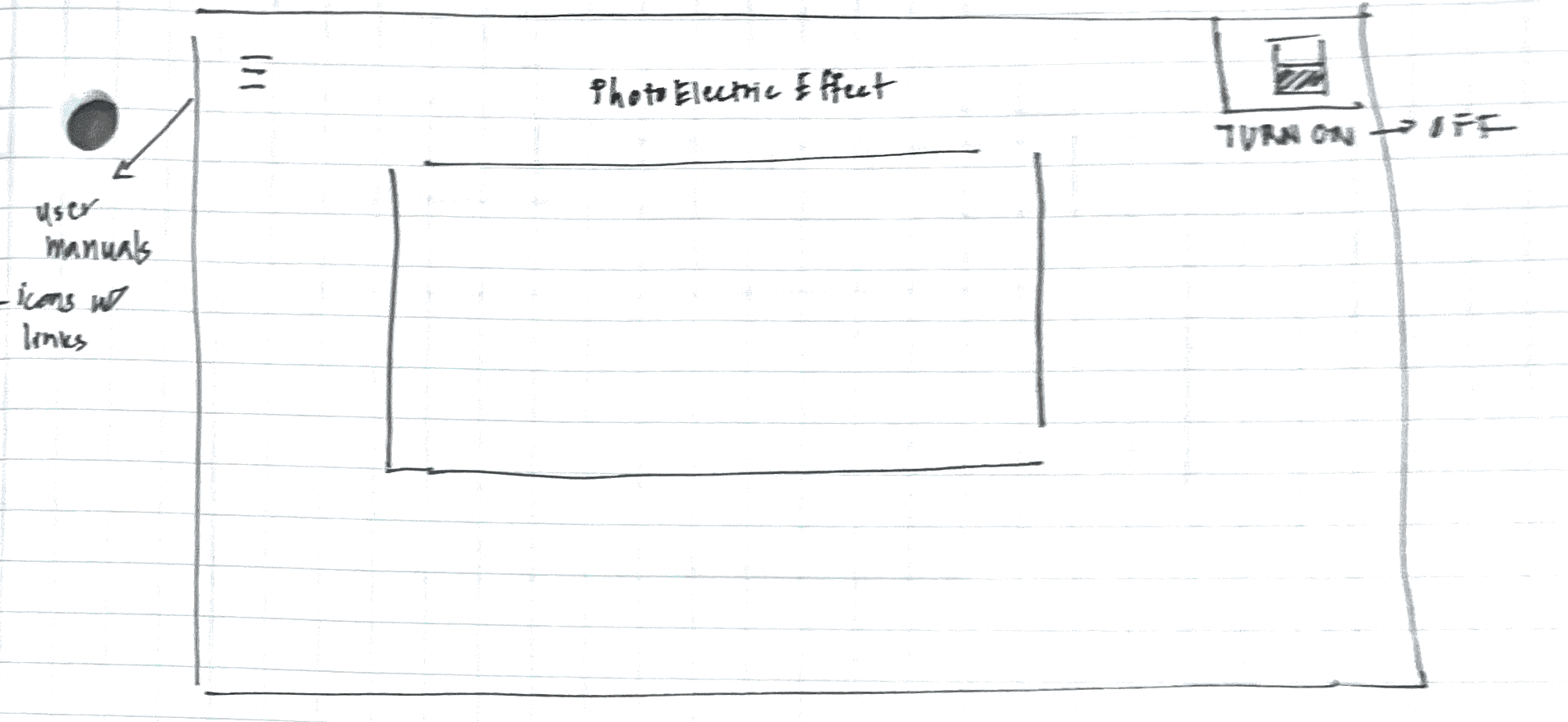


I knew I wanted the light switch to always be in the corner that is easily noticeable by the user, since it's the first action they take when they visit the lab. So, I moved to Figma to make some lo-fidelity mockups.
I knew I wanted the light switch to always be in the corner that is easily noticeable by the user, since it's the first action they take when they visit the lab. So, I moved to Figma to make some lo-fidelity mockups.
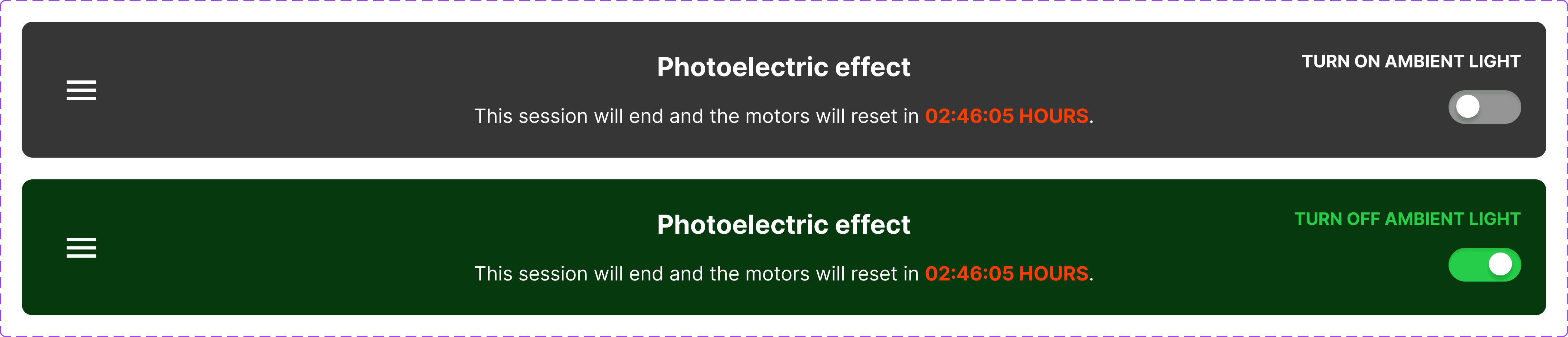
So I narrowed in on some header possibilities, maintaining the title of the lab and still displaying when the livestream session would end.
So I narrowed in on some header possibilities, maintaining the title of the lab and still displaying when the livestream session would end.


The grayish "dark mode" gave a more standard industrial look. I began working towards a dark interface, as well as going beyond the standard light switch image design that was currently in place .
The grayish "dark mode" gave a more standard industrial look. I began working towards a dark interface, as well as going beyond the standard light switch image design that was currently in place .
This light switch design was simpler, more intuitive, and modern. Furthermore, I chose green as the accent color to enhance the interface's overall design system.
This light switch design was simpler, more intuitive, and modern. Furthermore, I chose green as the accent color to enhance the interface's overall design system.


lo-fidelity wireframes. two issues I tackled here was the layout of the tools and the location of manuals.
lo-fidelity wireframes. two issues I tackled here was the layout of the tools and the location of manuals.
manuals.
manuals.
A lot of the tools had manuals that the user could click on in order to view more information about it. However, these manuals were located in arbitrary places, making it unclear how we could display
A lot of the tools had manuals that the user could click on in order to view more information about it. However, these manuals were located in arbitrary places, making it unclear how we could display


Not only were the manual placements inconsistent, the design to click and view the manuals were also inconsistent.
So, I added a menu button to the header from above, which would open a sidebar where the user can access manuals of the tools in that lab.
Not only were the manual placements inconsistent, the design to click and view the manuals were also inconsistent.
So, I added a menu button to the header from above, which would open a sidebar where the user can access manuals of the tools in that lab.
tool layout.
tool layout.
The tools were scattered throughout the website, some on the sides of the livestream, a couple at the bottom where the user would have to scroll to get to.
The tools were scattered throughout the website, some on the sides of the livestream, a couple at the bottom where the user would have to scroll to get to.
The first challenge was eliminating the need to scroll — so I put each tool in its own box with instructions on how to use it:
The first challenge was eliminating the need to scroll — so I put each tool in its own box with instructions on how to use it:

But expanding this to other labs would have proven to be difficult due to consistency issues!
The most simple fix to this was creating a toolbar where the user could access the tools from a consistent place, no matter the lab:
But expanding this to other labs would have proven to be difficult due to consistency issues!
The most simple fix to this was creating a toolbar where the user could access the tools from a consistent place, no matter the lab:
Default:
Default:

Hover:
Hover:

Active:
Active:

the remaining item to design was the actual tool display!
the remaining item to design was the actual tool display!
The challenge was ensuring that each tool display clearly presented the information, explained the tool’s mechanics, and made it obvious that the user could interact with it.
Therefore, when the user clicks on a tool in the tool bar, it opens the tool on the right of the livestream, like so:
The challenge was ensuring that each tool display clearly presented the information, explained the tool’s mechanics, and made it obvious that the user could interact with it.
Therefore, when the user clicks on a tool in the tool bar, it opens the tool on the right of the livestream, like so:

starting the experiment
starting the experiment
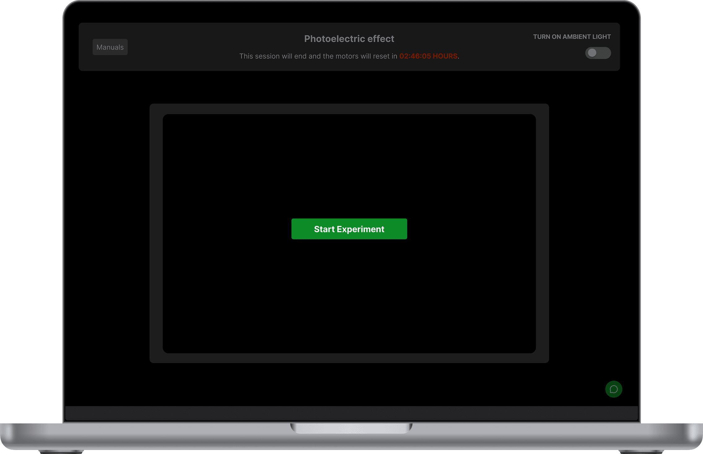
In the original user flow, users were plunged straight into the experiment, which I learned from feedback was overwhelming. To address this, I added a "Start the Experiment" button to ease them into the process more gradually, and a "Leave" button for the user to be able to leave the experiment.
In the original user flow, users were plunged straight into the experiment, which I learned from feedback was overwhelming. To address this, I added a "Start the Experiment" button to ease them into the process more gradually, and a "Leave" button for the user to be able to leave the experiment.

usability tests
usability tests
After prototyping the hi-fidelity wireframes, I conducted a quick usability test to gain feedback, and here were the results, as well as the fixes.
After prototyping the hi-fidelity wireframes, I conducted a quick usability test to gain feedback, and here were the results, as well as the fixes.
resizing not intuitive
When users were prompted to resize the two windows (livestream and tool sections), they reported not being able to find the resizer as quickly as they would have liked.
Original:

Fixed: A sleeker resizing button that mimics the split screen functionality found in Apple products.

unclear manuals location
To fix this, I changed the ambiguous hamburger menu button to a labeled "Manuals" button to improve the discoverability of the lab equipment manuals.

final prototype (Photoelectric Lab)
final prototype (Photoelectric Lab)
Kavya Verma
Contact
kavya.verma@gmail.com
Kavya Verma
Contact
kavya.verma@gmail.com
Kavya Verma
Contact
kavya.verma@gmail.com