



Jun - Sep 2024
Style Guide
Style Guide
Style Guide
Design @ Malbek
Design @ Malbek
internship duration
internship duration
Jun - Sept 2024
team
team
VP of Product (manager)
Principal Engineer
my role
my role
UI/UX Design Intern
skills
skills
UI/UX Design
Figma
SaaS Design
style guide deck: standardizing the interface design
style guide deck: standardizing the interface design
My keystone project at Malbek was standardizing a design system with the help of my manager, a process that involved several steps to ensure consistency across the interface.
Here are some examples of inconsistencies I found and components that I standardized to adhere to a common design.
My keystone project at Malbek was standardizing a design system with the help of my manager, a process that involved several steps to ensure consistency across the interface.
Here are some examples of inconsistencies I found and components that I standardized to adhere to a common design.
Slide Examples from Presentation Deck
Slide Examples from Presentation Deck


identifying UI inconsistencies
In order to create a comprehensive design system for a company, I explored the interface in detail, noting UI elements that seemed inconsistent with each other.
In order to create a comprehensive design system for a company, I explored the interface in detail, noting UI elements that seemed inconsistent with each other.
example: standardizing modals
example: standardizing modals
generic modal dialog inconsistencies:
Incorrect modals. These are just a couple examples of inconsistencies I found as I was navigating through the system.
Incorrect modals. These are just a couple examples of inconsistencies I found as I was navigating through the system.
Action buttons locations are inconsistent.
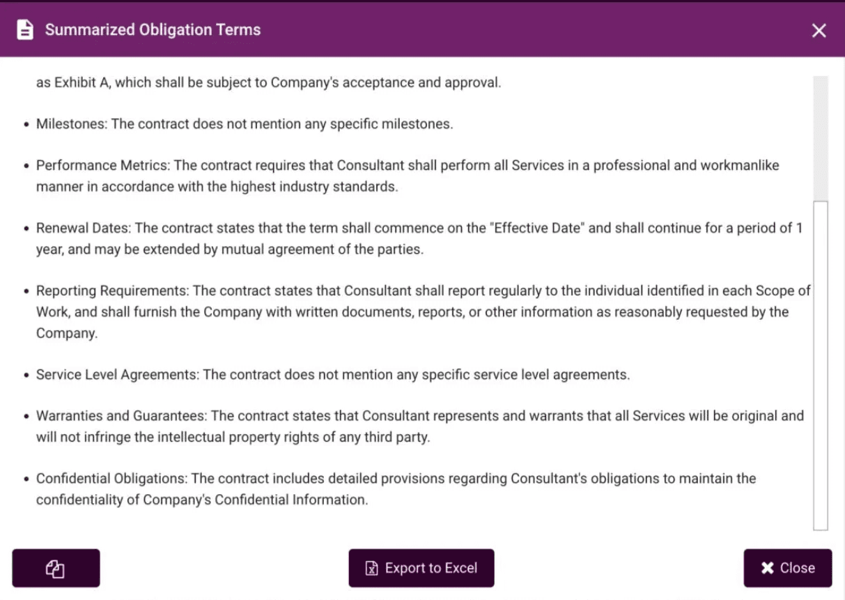
Primary actions in purple should be located at the bottom right

Correct modals. After finding the inconsistencies, I redesigned modals where necessary according to the correct design and organized them by type.
Correct modals. After finding the inconsistencies, I redesigned modals where necessary according to the correct design and organized them by type.

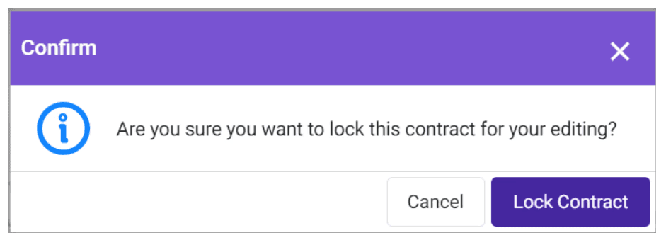
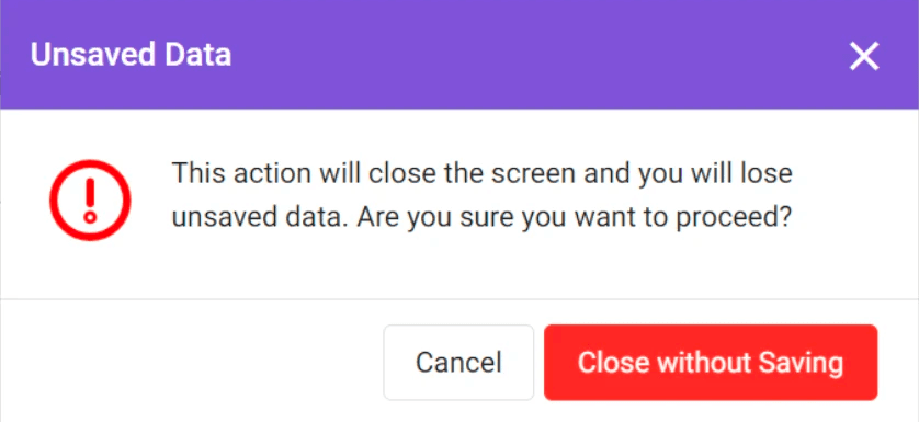

finding style guide references
We used Google Material Design icons to include in my mockups across the internship, and took inspiration from Atlassian's design system when it came to standardizing these four key types of action dialogs:
We used Google Material Design icons to include in my mockups across the internship, and took inspiration from Atlassian's design system when it came to standardizing these four key types of action dialogs:
example: main dialogs
example: main dialogs
Confirmation Dialog: pops up to confirm that the user performed the action successfully.
This dialog is not present in the system currently, so I mocked up a couple of dialogs that would indicate confirmation.
Confirmation Dialog: pops up to confirm that the user performed the action successfully.
This dialog is not present in the system currently, so I mocked up a couple of dialogs that would indicate confirmation.

Information Dialog: when there is no risk to the user, we're just informing them of something, or wanting them to acknowledge something
Information Dialog: when there is no risk to the user, we're just informing them of something, or wanting them to acknowledge something
Correct:
Correct:
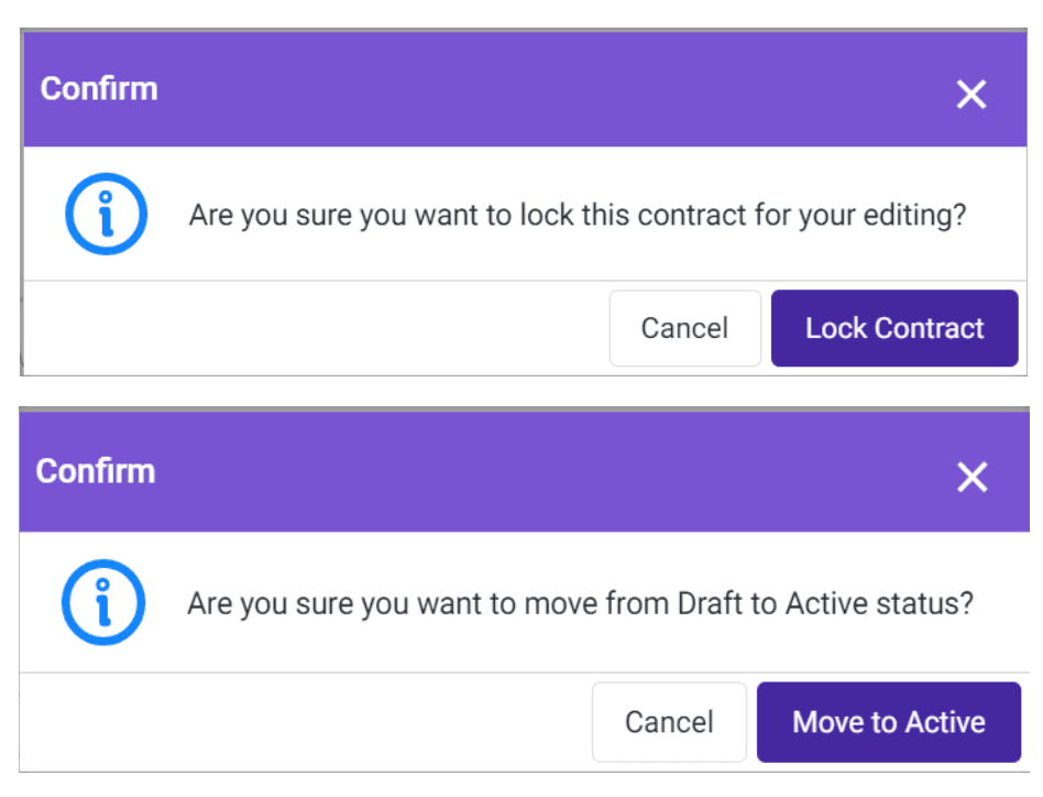
Incorrect:
Incorrect:

Are you sure? Destructive Dialog: When the action the user is taking will result in a loss of data, deletion. Prevents user from taking an irreversible action.
Are you sure? Destructive Dialog: When the action the user is taking will result in a loss of data, deletion. Prevents user from taking an irreversible action.
Correct:
Correct:
Incorrect:
Incorrect:

Caution Dialog: warns users of a significant change.
This dialog is also not present in the system currently, so I mocked up a dialog that would indicate caution.
Correct:
Correct:
Incorrect:
Incorrect:


design suggestions and mockups
In order to standardize the inconsistencies that I found within the interface, I mocked up some replacement designs for those inconsistent components.
Referring back to the modal/icon inconsistencies, I made some suggestions to standardize them according to the correct components in the system.
In order to standardize the inconsistencies that I found within the interface, I mocked up some replacement designs for those inconsistent components.
Referring back to the modal/icon inconsistencies, I made some suggestions to standardize them according to the correct components in the system.
example
Advanced Filter Modal: When the user wants to filter through contract reports, a filter modal pops up. They can then click on "Advanced" to create more specific conditions for their filters:
example
Advanced Filter Modal: When the user wants to filter through contract reports, a filter modal pops up. They can then click on "Advanced" to create more specific conditions for their filters:

Problems: Doesn't follow the modal header format and inconsistent coloring for the icons. The add button is purple i other places.
Problems: Doesn't follow the modal header format and inconsistent coloring for the icons. The add button is purple i other places.
Fix: Convert to the generic modal design and correct add and remove icons
Fix: Convert to the generic modal design and correct add and remove icons

By using these steps, we standardized on many important patterns and components, and pitched the guide to the CEO of Malbek.
The goal of this guide would be to train the team on these key patterns and components, leading it to become a resource that both the Dev and QA teams can reference, and driving speed and consistency.
By using these steps, we standardized on many important patterns and components, and pitched the guide to the CEO of Malbek.
The goal of this guide would be to train the team on these key patterns and components, leading it to become a resource that both the Dev and QA teams can reference, and driving speed and consistency.
Slide Examples
takeaways + impact
takeaways + impact
Creating a systemized style guide that engineers at Malbek could adhere to was a challenging but impactful experience that spanned over the summer, and I learned to take a more sophisticated look and overview at the interface as I was creating the guide.
This was challenging in terms of gathering different components across the interface. I found that due to this being a startup, features were implemented at a very fast pace, leading to inconsistent styling, so the style guide would increase speed of implementation and ensure consistency at the same time.
Additionally, organizing the components and patterns in a slide deck was another challenge because we had to point out where UI elements were being styled wrong and also make suggestions to standardize them.
If I were to go back and continue my work, I would involve myself more in researching users and studying clientele feedback more thoroughly to drive my designs, and work on more complex tasks such as optimizing Malbek's approval workflow feature.
Additionally, I learned how to design in a fast-paced environment, where priorities change quickly and frequently, and how to design for specific users (sales, procurement, etc.)
Designing at Malbek taught me that balancing user needs and business goals is important, as well as the value in having a standardized interface for any design that I do.
Creating a systemized style guide that engineers at Malbek could adhere to was a challenging but impactful experience that spanned over the summer, and I learned to take a more sophisticated look and overview at the interface as I was creating the guide.
This was challenging in terms of gathering different components across the interface. I found that due to this being a startup, features were implemented at a very fast pace, leading to inconsistent styling, so the style guide would increase speed of implementation and ensure consistency at the same time.
Additionally, organizing the components and patterns in a slide deck was another challenge because we had to point out where UI elements were being styled wrong and also make suggestions to standardize them.
If I were to go back and continue my work, I would involve myself more in researching users and studying clientele feedback more thoroughly to drive my designs, and work on more complex tasks such as optimizing Malbek's approval workflow feature.
Additionally, I learned how to design in a fast-paced environment, where priorities change quickly and frequently, and how to design for specific users (sales, procurement, etc.)
Designing at Malbek taught me that balancing user needs and business goals is important, as well as the value in having a standardized interface for any design that I do.
Kavya Verma
Contact
kavya.verma@gmail.com
Kavya Verma
Contact
kavya.verma@gmail.com
Kavya Verma
Contact
kavya.verma@gmail.com