

Sep - Dec 2023
Sep - Dec 2023
Sep - Dec 2023
Amazon Website Redesign
Amazon Website Redesign
PROBLEM
PROBLEM
Amazon is a widely known e-commerce company that provides a quick and efficient product ordering experience.
We outlined the purposes of the company as the following:
Provides a large variety of products such as necessities, gifts, clothes.
Offers deals, prime membership, and fast delivery options.
Recommends products based on your search history and past items bought.
However, during our overview, we noticed some issues with the main website:
Cluttered homepage.
Too many products shown on the homepage without having a clear visual hierarchy and structure.
Amazon is a widely known e-commerce company that provides a quick and efficient product ordering experience.
We outlined the purposes of the company as the following:
Provides a large variety of products such as necessities, gifts, clothes.
Offers deals, prime membership, and fast delivery options.
Recommends products based on your search history and past items bought.
However, during our overview, we noticed some issues with the main website:
Cluttered homepage.
Too many products shown on the homepage without having a clear visual hierarchy and structure.
THE TEAM
THE TEAM
On a team of 1 project manager and 2 designers, I worked as a designer.
On a team of 1 project manager and 2 designers, I worked as a designer.
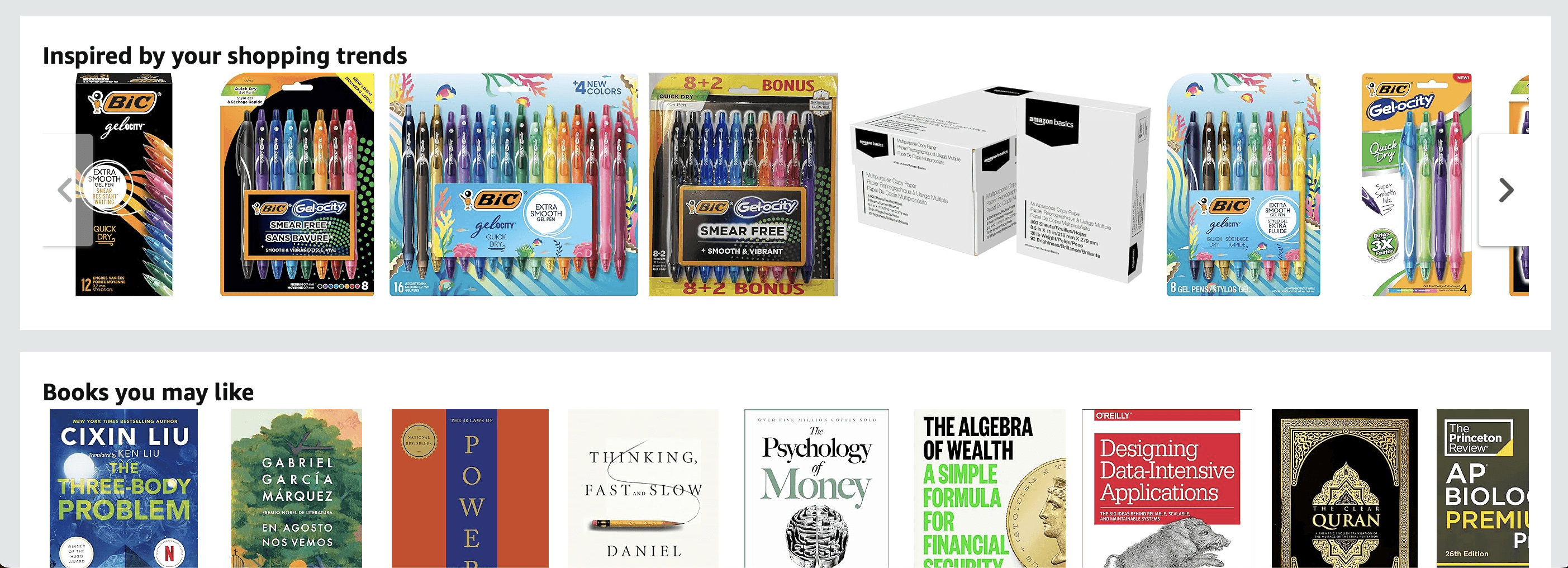
Cluttered Navigation Bar

Too many recommendations provided by the website
HOW DO WE APPROACH THIS?
HOW DO WE APPROACH THIS?
HOW DO WE APPROACH THIS?
We wanted to explore potential enhancements to the current Amazon website design that address these issues, and overall provides a more enjoyable shopping experience for the user.
With Amazon being a major and successful corporation, we wanted to explore ideas that would not alter the user experience of the website drastically, so we surveyed users to find out what people found fulfilling and dissatisfying about the experience.
We wanted to explore potential enhancements to the current Amazon website design that address these issues, and overall provides a more enjoyable shopping experience for the user.
With Amazon being a major and successful corporation, we wanted to explore ideas that would not alter the user experience of the website drastically, so we surveyed users to find out what people found fulfilling and dissatisfying about the experience.
We wanted to explore potential enhancements to the current Amazon website design that address these issues, and overall provides a more enjoyable shopping experience for the user.
With Amazon being a major and successful corporation, we wanted to explore ideas that would not alter the user experience of the website drastically, so we surveyed users to find out what people found fulfilling and dissatisfying about the experience.
LEARNING ABOUT AMAZON'S USERS
LEARNING ABOUT AMAZON'S USERS
Our data-collecting method involved asking open-ended questions about our target users' (18-30) likes and/or dislikes, and we found that there was a wide spectrum of how much people used the website.
After lengthy surveying, we narrowed our main insights:
Our data-collecting method involved asking open-ended questions about our target users' (18-30) likes and/or dislikes, and we found that there was a wide spectrum of how much people used the website.
After lengthy surveying, we narrowed our main insights:
Most users preferred to read product description and reviews to determine whether the product is a scam or not.
Users wanted a better regulation of products that they are recommended; they feel that there are too many products that are displayed for them on the homepage. Highest rating products should be recommended more.
Users wanted better scam detection for products.
Most users preferred to read product description and reviews to determine whether the product is a scam or not.
Users wanted a better regulation of products that they are recommended; they feel that there are too many products that are displayed for them on the homepage. Highest rating products should be recommended more.
Users wanted better scam detection for products.
ORGANIZING OUR DATA
ORGANIZING OUR DATA
Utilizing an affinity map, we organized our survey data into two main categories:
Utilizing an affinity map, we organized our survey data into two main categories:
1) HIGHLIGHTED IMPORTANT FEATURES
1) HIGHLIGHTED IMPORTANT FEATURES
Majority of users use the SEARCH BAR instead of browsing.
Most users use REVIEWS to evaluate product credibility.
Majority of users use the SEARCH BAR instead of browsing.
Most users use REVIEWS to evaluate product credibility.
2) PAIN POINTS
2) PAIN POINTS
OVERWHELMING amount of items on homepage and after searching prevents finding a good quality product with good pricing.
FAKE items, pricing & description seemed too good to be true.
OVERWHELMING amount of items on homepage and after searching prevents finding a good quality product with good pricing.
FAKE items, pricing & description seemed too good to be true.
After narrowing down the features users believed were important and their pain points, we defined our goals for the redesign:
After narrowing down the features users believed were important and their pain points, we defined our goals for the redesign:
2) OUR GOALS
2) OUR GOALS
DECLUTTER the homepage.
Add VERIFICATION BADGE on products.
Curate the highest rating and MOST RELEVANT/LEGITIMATE ITEMS TO THE TOP.
Move REVIEWS SECTION CLOSER to the product description for easy access.
DECLUTTER the homepage.
Add VERIFICATION BADGE on products.
Curate the highest rating and MOST RELEVANT/LEGITIMATE ITEMS TO THE TOP.
Move REVIEWS SECTION CLOSER to the product description for easy access.
KICKING OFF THE DESIGN
KICKING OFF THE DESIGN
PAPER WIREFRAMES
PAPER WIREFRAMES
FROM PAIN POINTS TO SKETCHES
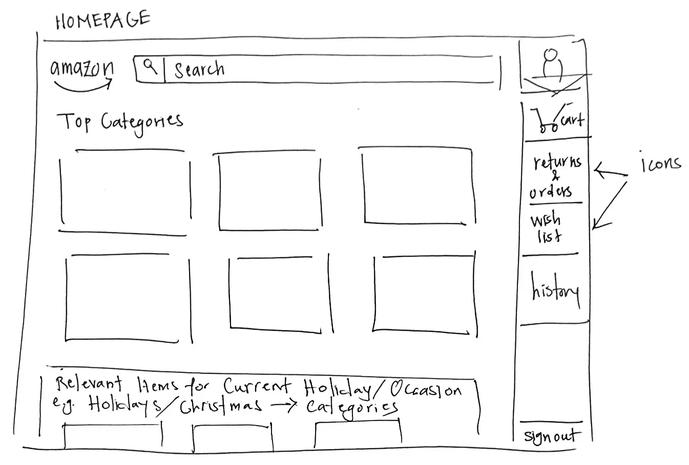
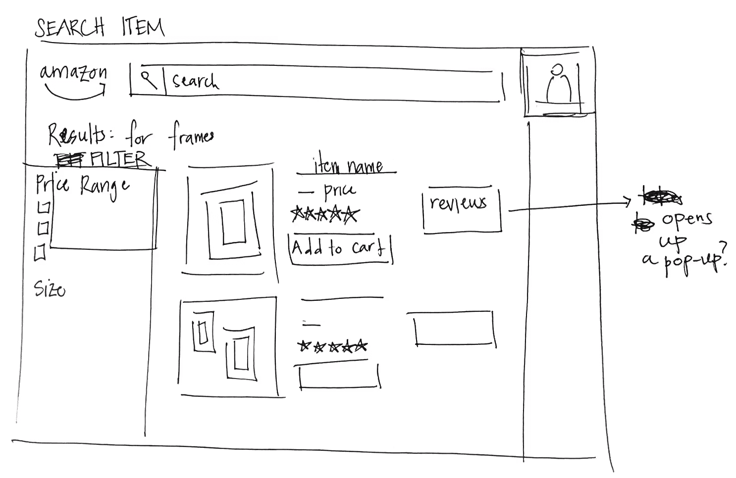
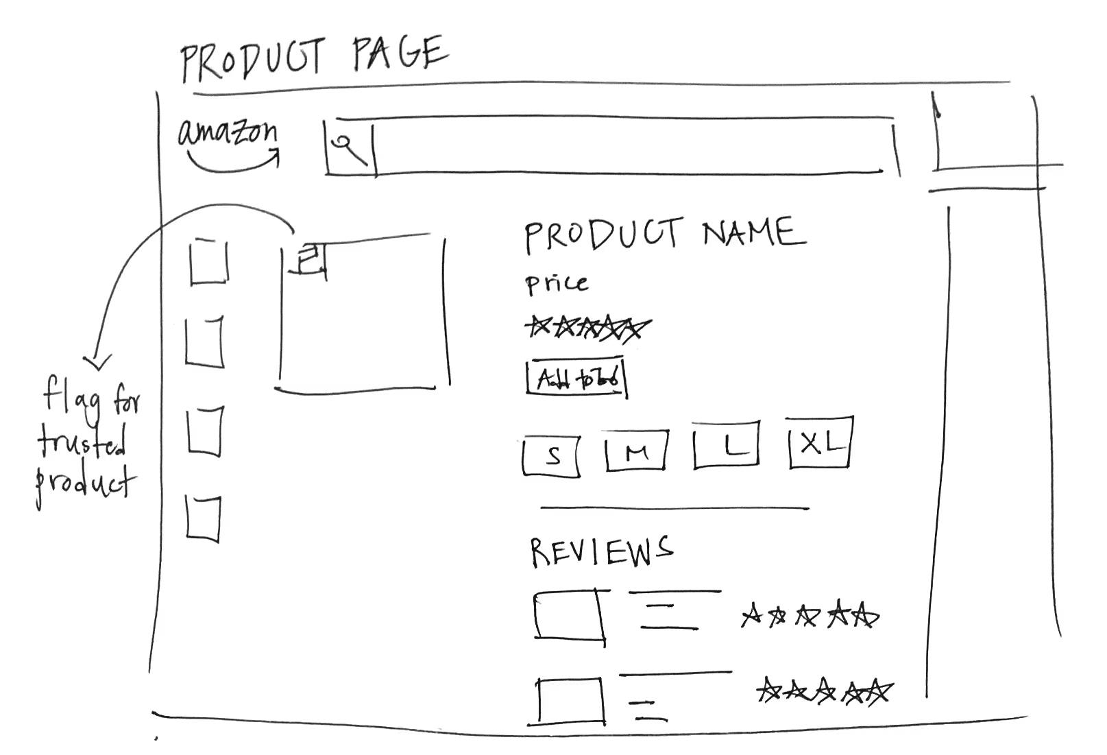
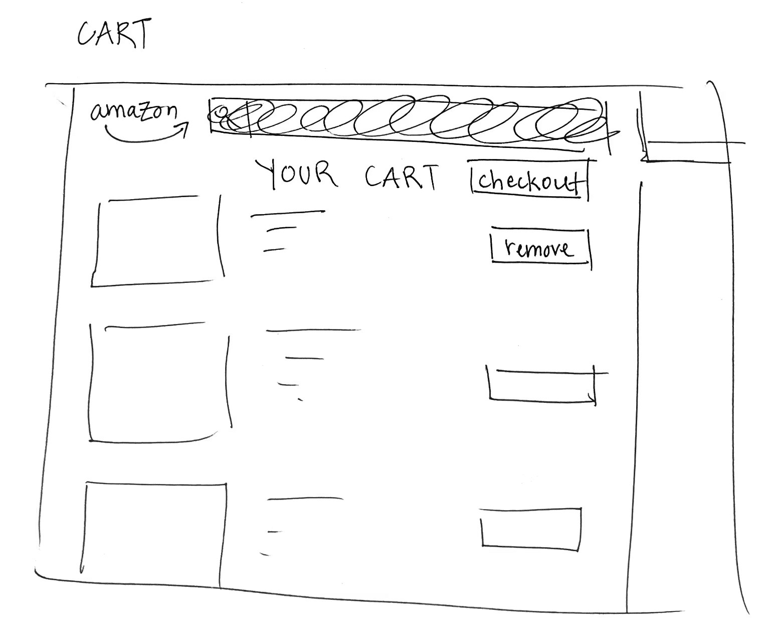
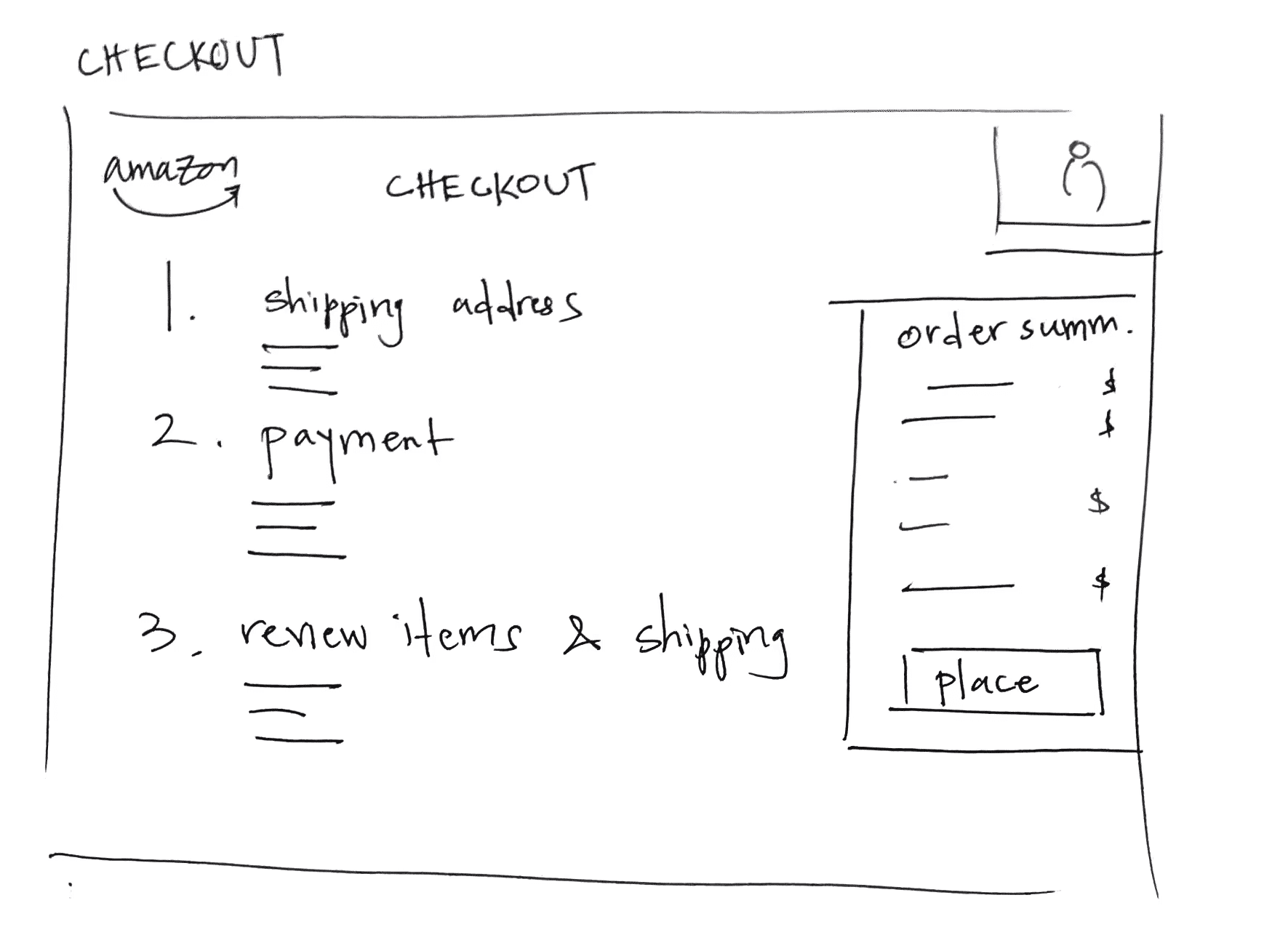
Keeping in mind the pains points we found and centering our focus on making the homepage less cluttered and adding scam detection, we sketched out some designs of the user flow for Amazon.
In order to make the homepage less cluttered, we decided to emphasize the deals and discounts that are available and the top categories recommended for the user, along with keeping the search bar at the top.
We also decided to add a feature that shows a verified tag next to each item, signifying that it has been verified as a trustworthy product and not a scam.
Keeping in mind the pains points we found and centering our focus on making the homepage less cluttered and adding scam detection, we sketched out some designs of the user flow for Amazon.
In order to make the homepage less cluttered, we decided to emphasize the deals and discounts that are available and the top categories recommended for the user, along with keeping the search bar at the top.
We also decided to add a feature that shows a verified tag next to each item, signifying that it has been verified as a trustworthy product and not a scam.
HI-FI DRAFTS
HI-FI DRAFTS
HI-FI DRAFTS - BRAINSTORMING WITH LAYOUTS
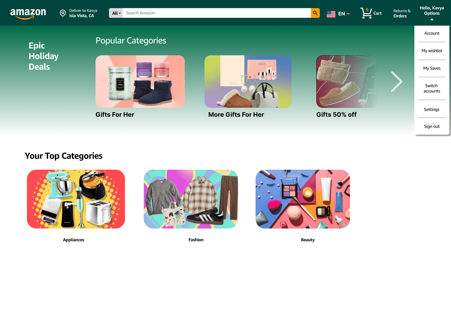
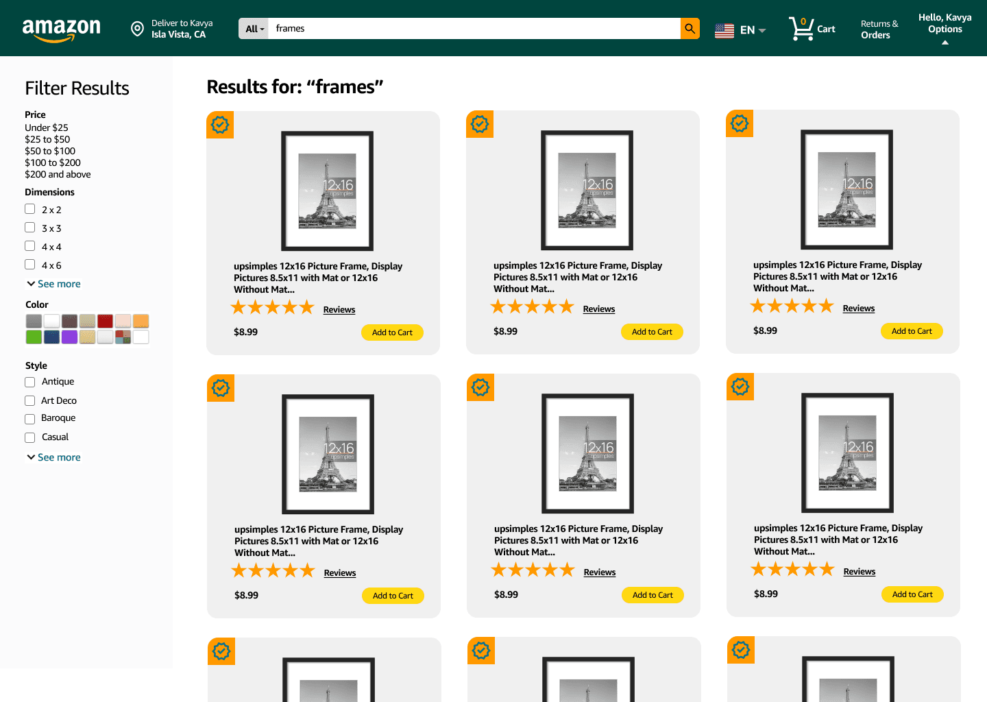
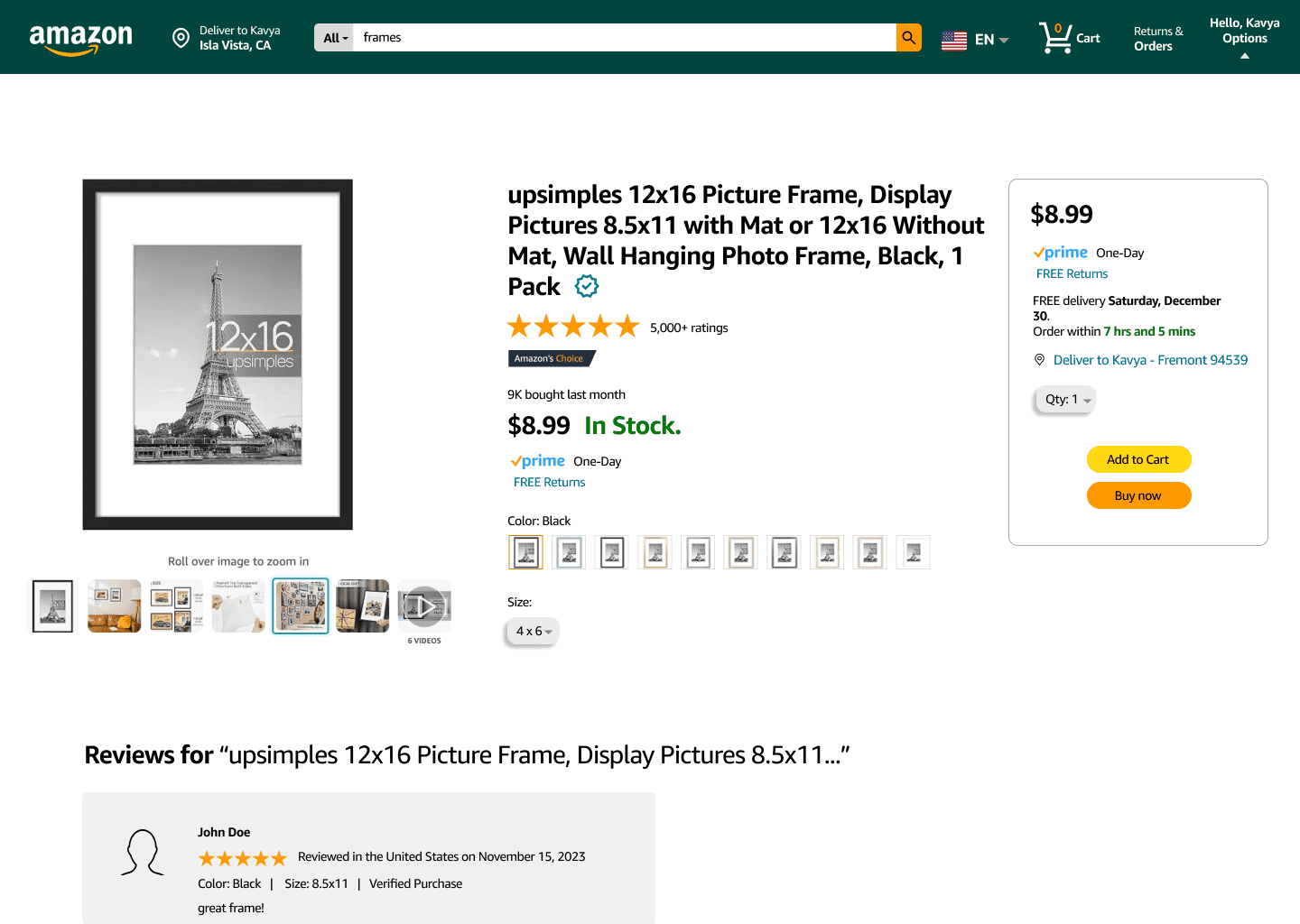
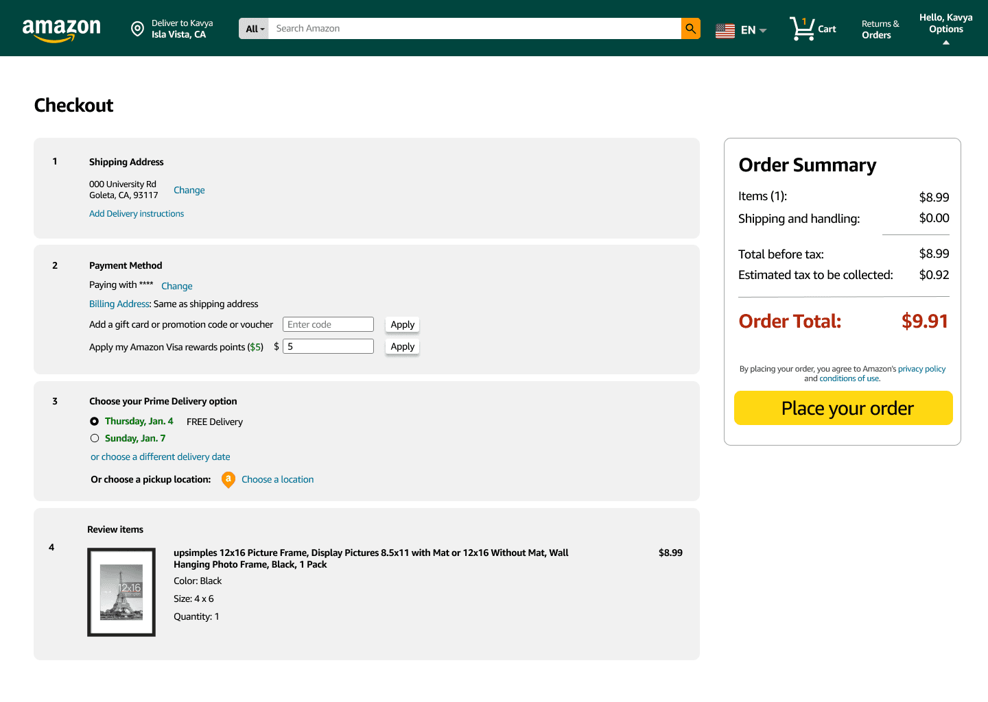
Moving on from our paper wireframes, we created some hi-fi drafts to get a picture of what our final design would look like.
In the second wireframe, we added a checkmark to each item, indicating that the item is verified and not a scam.
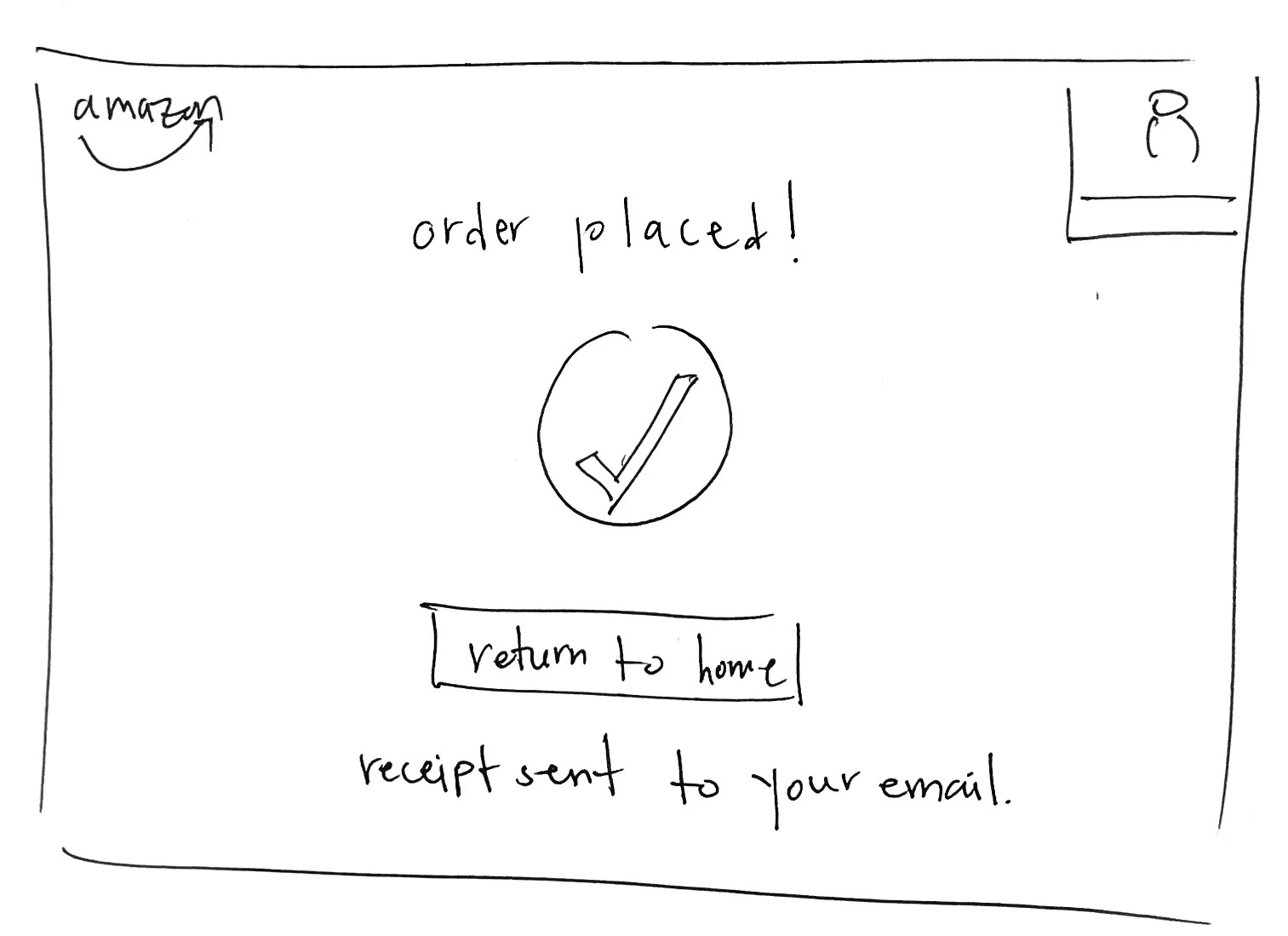
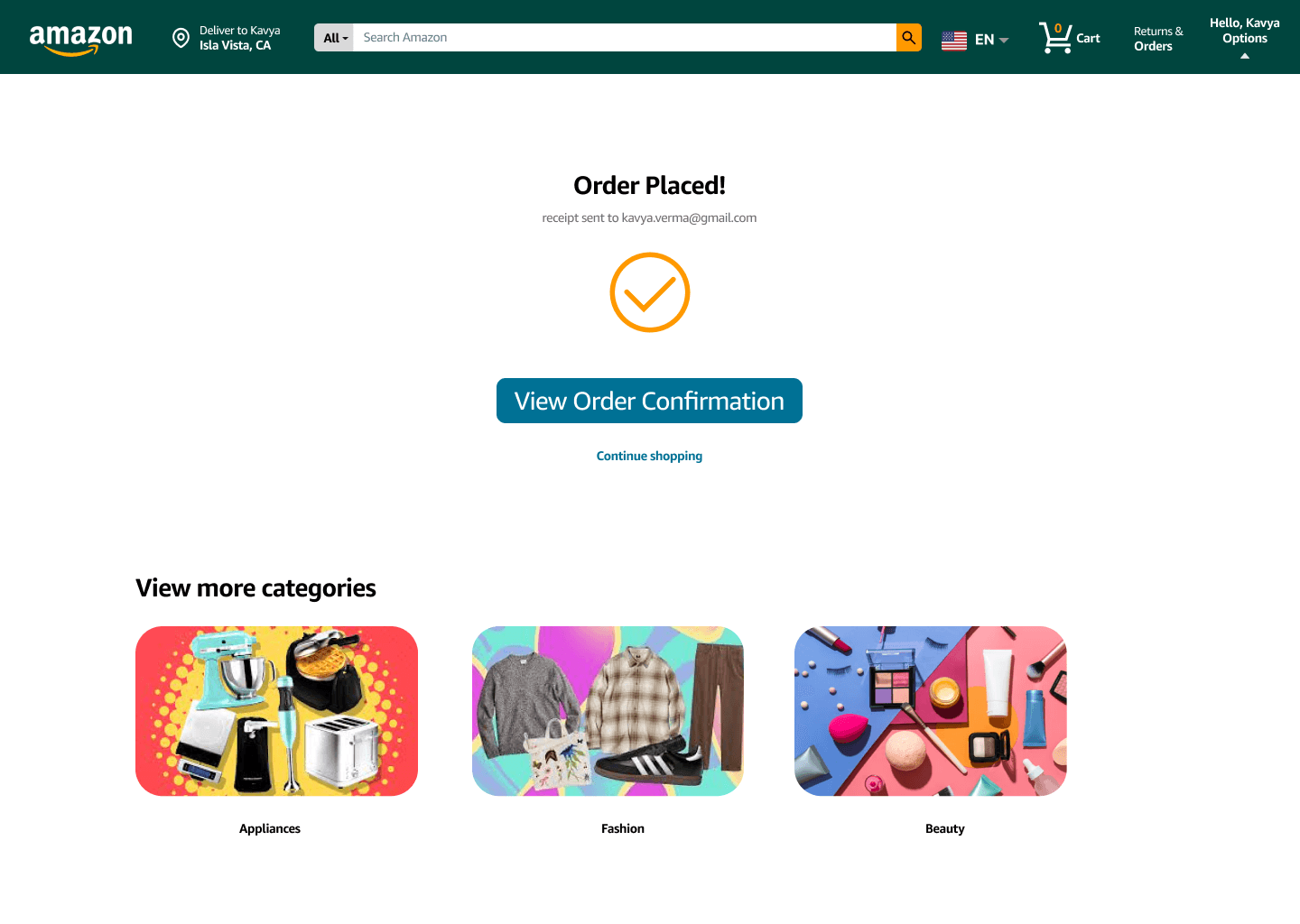
In the last wireframe, we decided to add an order confirmation page, where the user could view the confirmation receipt or continue shopping.
Overall, the purpose was to clean up the home page and organize the structuring of the flows.
Moving on from our paper wireframes, we created some hi-fi drafts to get a picture of what our final design would look like.
In the second wireframe, we added a checkmark to each item, indicating that the item is verified and not a scam.
In the last wireframe, we decided to add an order confirmation page, where the user could view the confirmation receipt or continue shopping.
Overall, the purpose was to clean up the home page and organize the structuring of the flows.
After constructing our lo-fis, we created our first draft of hi-fis using Figma.
In the second wireframe, I added a checkmark to each item, indicating that the item is verified and not a scam.
The last page depicts a confirmation page, which allows the user to view their order confirmation and take further steps.
Overall, the purpose was to clean up the home page and organize the structuring of the flows.
FROM DRAFTS TO FINAL
FROM DRAFTS TO FINAL
FINAL PRODUCT
One additional change we decided to make was to add a a bright orange menu bar on the top left corner of the website. When the user clicks on it, they would be able to view different departments, Amazon services, and settings.
We also removed the nav bar, but the user would still be able to access those categories in this menu bar.

One additional change we decided to make was to add a a bright orange menu bar on the top left corner of the website. When the user clicks on it, they would be able to view different departments, Amazon services, and settings.
We also removed the nav bar, but the user would still be able to access those categories in this menu bar.
One additional change we decided to make was to add a a bright orange menu bar on the top left corner of the website. When the user clicks on it, they would be able to view different departments, Amazon services, and settings.
We also removed the nav bar, but the user would still be able to access those categories in this menu bar.
On the homepage, we organized the relevant categories (e.g., recently viewed, trending, etc.)
On the homepage, we organized the relevant categories (e.g., recently viewed, trending, etc.)

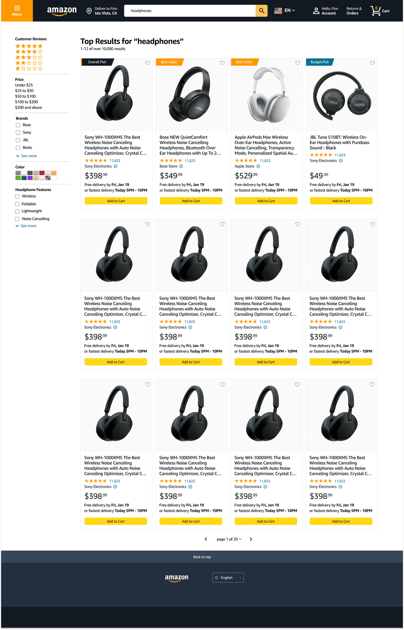
When the user searches for a product, the most relevant/popular products are shown at the top in a separate section, and the rest are displayed below.
When the user searches for a product, the most relevant/popular products are shown at the top in a separate section, and the rest are displayed below.
On the product page, the reviews are located right below the product description so that users can use both the description and reviews to decide whether they want to purchase it.
On the product page, the reviews are located right below the product description so that users can use both the description and reviews to decide whether they want to purchase it.

REFLECTING BACK
REFLECTING BACK
As a reflection of my team's work, if we were to continue this project, I would conduct usability tests to test these parts of the website experience we changed. For example, we could have the user navigate through the website flow and look for reviews, and gain some insight on how they feel about the new placement of this section. I would also have liked to gain feedback on the scam detector that we designed for products, and learn about new ways we could effectively continue designing this feature.
Through this project, I was able to expand my horizons into website design and adhering to a large company's brand and design system.
Kavya Verma
Contact
kavya.verma@gmail.com
Kavya Verma
Contact
kavya.verma@gmail.com
Kavya Verma
Contact
kavya.verma@gmail.com